Part 1: Chapter 16 entails designing reader centered documents and pages that will help readers understand, locate, and notice highly critical information. The reader centered approach comprising of six important elements: text, graphics, headings and titles, white space, headers and footers, and physical features. These six elements can be arranged in different forms to achieve efficient reader centered communications. The chapter states several guidelines that are critical for overall design of documents. One statement that surprised me was to avoid using italics for more than a sentence at a time. I have always assumed that it can be used to emphasize a particular content, but it can obscure the main lines. I have taken a user interface design class where I had to build a prototype for an application implementing most of the guidelines stated in this chapter. It is critical to have a consistent design elements so that the reader is not confused. The prototype that I build complied to gestalt principles which are used to organize the elements so that readers can perceive complex scenes. Mostly all the guidelines in this chapter can be used in the future. We can use it for designing any professional document. Making the documents intuitive for the reader to understand will increase the efficiency.
Part 2: Out of the 4 designs, I had a hard time deciding which design would work the best. Designs 3 and 4 seemed did not have much differences in terms of the layout and guidelines it followed. I have concluded that design number 3 would work the best and design number 2 would be the worst. In design 3, the graphic designer was very consistent with the font type and alignment of the design elements. The key labels were bold, so that the reader would know what to focus on. The only issue I found with this design was that the label "Caution" wasn't bold or capitalized. That's the section where design 4 excels. For design 3, the designer used laws of proximity and relativity so that the reader can create a visual link between the title and each labels. I have chosen design 2 to be the worst out of all because of the inconsistency in the design. There is an entire section/block dedicated to the registered trade mark sign of the prescription medication. The text informing the reader about other critical information about the med seems less relevant compared to the trade mark sign. Also, design 2 used red color to display the name and other information of the medication. This color can have negative associations in certain cultures.
Monday, January 25, 2016
Friday, January 22, 2016
Blog Posting #1. Creating Reader-Centered Graphics
Part 1: The first type of graphics I noticed in one of my textbooks is a line graph (Figure 1). In the context of the text book, it shows correlational evidence for two variables. The graph contained all the required components such as the figure number, a precise title, several data points, labels for both axes, and axis length. The line graph used appropriate colors to highlight the crucial message. It used bright colors so that the reader knows where to focus first. The graph is very simple with only manageable amount of materials with only necessary details. The graph has also provided a very informative title making it intuitive for the reader.
Another type of graphics that I noticed is a Table (Figure 2). The table seems to comply to the required design of a formal table. It contains a source, table number and title, column and row headings, and footnotes as a guide to what certain headings mean. The table follows the guideline of getting permission and citing the sources for the graphics. For the context that it is used, the table can increase the persuasiveness that it is trying to establish. This conveys the data in a significant manner which impacts its persuasiveness. The table is also integrated with the text. It is referred a few times on the same page.
Part 2:


Organizational Chart: The purpose of organizational charts is to help readers understand the structure of the units in the organization. The following graphic is used to display the charge of each positions. This follows the guideline of simplifying the graphics. This chart has made it intuitive to understand the structure.

 |
| Figure 1- Line graph |
Another type of graphics that I noticed is a Table (Figure 2). The table seems to comply to the required design of a formal table. It contains a source, table number and title, column and row headings, and footnotes as a guide to what certain headings mean. The table follows the guideline of getting permission and citing the sources for the graphics. For the context that it is used, the table can increase the persuasiveness that it is trying to establish. This conveys the data in a significant manner which impacts its persuasiveness. The table is also integrated with the text. It is referred a few times on the same page.
 |
| Figure 2: Table |
Part 2:
Drawing: In CS documents drawings can be used to locate and identify certain features. It is used to understand how something is constructed. This follows the guideline of designing the graphics so that it supports reader's tasks. This graphic is used to identify components of a computer.
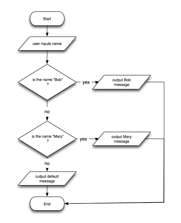
Flowchart: In CS documents flowcharts can be used to understand a process. It lists the steps in the process and labels each step. This graphic conveys boolean logic by checking if an input is Bob or Mary.

Organizational Chart: The purpose of organizational charts is to help readers understand the structure of the units in the organization. The following graphic is used to display the charge of each positions. This follows the guideline of simplifying the graphics. This chart has made it intuitive to understand the structure.

Schedule Chart: In CS documents a schedule chart can be used to understand the schedule in completing a project. In the graphic the bars indicate when the steps will be completed. This graphic complies to using appropriate color to support the message and supporting reader's tasks.


Table: A table can be used to display data and find, and use information and facts. This graphic shows the primitive datatypes, its description, range, and sample declaration and initialization


Line Graph: In CS documents line graphs can be used to understand the relationships among variables and display a trend. This graphics portrays a burn down chart as part of project management. It shows what amount of work is done in a specific time period.


Pie Chart: In CS documents pie charts can be used to see the relative sizes of the parts of a whole.
The graphic shows the percentage of new STEM jobs by area through 2018. There is a sub chart that shows the distribution of computing based jobs.

The graphic shows the percentage of new STEM jobs by area through 2018. There is a sub chart that shows the distribution of computing based jobs.

Screen Shots: In CS documents screen shots can be used to present directions or help readers locate items. This graphic shows directions on how to install Windows 8. These visual cues follow many of the guidelines for reader-centered graphics.

Photograph: In CS documents, photographs are used to see how something looks, locate something, or do something. It is similar to drawings but the details can be more visible in a photograph. This graphic is a photograph of many computer hardware parts. The actual photograph can help the reader accurately identify the parts.

Photograph: In CS documents, photographs are used to see how something looks, locate something, or do something. It is similar to drawings but the details can be more visible in a photograph. This graphic is a photograph of many computer hardware parts. The actual photograph can help the reader accurately identify the parts.

Subscribe to:
Comments (Atom)